Imagine Doing Your Blog Right
- Rani

- Mar 1, 2021
- 2 min read
So, one thing I'm known for being VERY big on at Yammer House is bloggers writing their blogs and writing them well. For the most part, we're pretty good with how we write and format our blogs, but every now and then there is one absolute shocker of a mistake that just kills us and it always looks terrible.
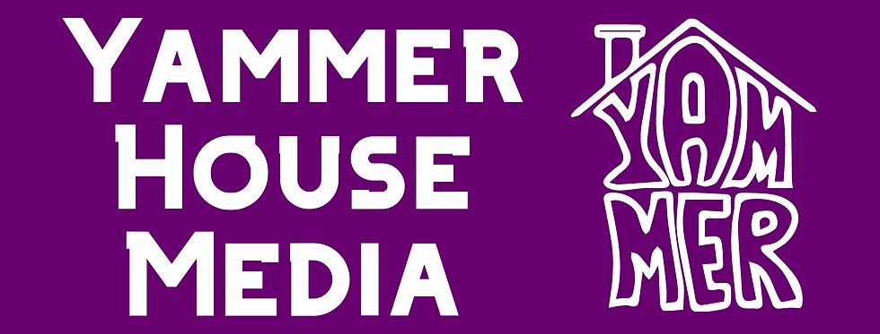
I bring this up because one of those situations just happened yesterday. It was awful. Long story short, Zeke has this actually pretty good series going called "Dumb Game of the Month" and it's actually entertaining because it is something different to the nonsense you normally see on the blog here. Basically, everyone will be somewhat (hopefully) familiar with the Yammer House social media banner we have this year... It looks like the thing just below this paragraph...

I think this looks quite good in the context of what it was made for. It looks pretty professional and stays true to our good, but still rough branding. I'm usually very happy for our bloggers to make their content as they typically wish. Authenticity is something I, and by extension Yammer House, really value. The issue is though, mediocrity is celebrated and mostly encouraged, but what I saw on the blog was just blatantly crap. I don't even want to talk about it, but here's what I saw.

I know... It's terrible. I hate it as much as anyone else. It looks terrible. Zeke is still new here, but if he's going to be deputy leading the same Yammer House Province that I am leading, he needs to do better than that. Hopefully he sees this blog and makes some very radical change to the appearance of his blog... Who knows. He may become a true Yammer House Blogger and do nothing at all.
Other than that, the blog was fine. I recommend it.


Comments